Charts in Excel
Tom Kelliher, CS 102
Dec. 10, 2003
Course evaluation.
Web sites due Friday @ 12:30 PM.
Remember, extra credit project due Monday @ 2:00 PM. Late projects will
be discarded.
Excel II lab.
- Loan payments in Excel.
- Charts in Excel.
- Exercise.
- ``A picture is worth 1,000 words.''
What is the purpose of a chart?
- Types of charts: bar, column, pie, line.
Variants: ``graduated'' bar chart.
How do you decide what chart to use?
Examples from the budget spreadsheet.
- Demonstration: Chart Wizard.
Outline of steps:
- Select ranges: numbers/formulas and labels.
- Click Chart Wizard button (looks like a column chart).
- Choose chart type.
- Add title, legends, other info.
- Insert into spreadsheet as object. Adjust position and size as
necessary.
- Selecting disjoint ranges.
Use budget.xls for demo.
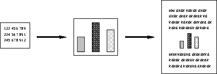
The ``big'' picture:

What if the numbers change? Will we have to re-insert the updated chart?
Not if we've inserted a link! Steps:
- To begin with, start with a chart that's embedded on a spreadsheet
page --- not a ``separate sheet'' chart.
- In Excel: Select chart, open Edit menu, and choose
Copy.
- In Word: Position insertion point in document where you want chart
to appear, open Edit menu, and choose Paste Special.
Select radio buttons for Paste Link.
- Adjust positioning and size of chart as necessary.
Demonstrate with class, using budget.xls.
Follow the lab. Also, practice creating a chart or two.
Thomas P. Kelliher
Wed Dec 10 09:59:01 EST 2003
Tom Kelliher

